Around a year ago, Layerise laid its first building blocks towards building a platform that empowers brands to quickly create and release product centric and end-customer optimised Product Assistants. We've spent every hour available towards that goal, and over the last year we've grown from being a platform that focuses on content delivery to a post-sale powerhouse. This rapid service and product evolution, where the design choices of the past are challenged by our current growth and speed, eventually means that our branding needs to adapt and cast a new and clear path forward throughout our next phase of business.
The problem
By the end of 2019 we reached a point where our visual identity didn't match our product evolution or our increasingly greater understanding of our brand values. Futhermore, on the pratical internal operations side, we lacked a unified design compass that would ensure consistency across designers, products, and channels.
To incoporate our product maturity and design indentity expectation, we went back to the drawing board to create a holistic, consistent, and scalable design language to use within all of our products and in our marketing and sales efforts.
The process
While Layerise already had an complex branding identity, we never really felt it managed to fully fullfill our values. We concluded that it lacked roots pointing towards our DNA. We wanted something that clearly, yet in a sophesticated maner represented who we are and what we do.
Redefining coorporate identity, is not particularly straight forward, yet with deep understanding of our DNA, goals and values it easier to articulate opinions and purpose. To kickstart the process we conducted brand personality workshops to define the design identity realm which we want to reach.
From the brand personality workshops a clearer picture was defined and we now had a formular to construct our new identity. In addition, to broaden our field of view and to conduct the branding excersize with the lens of our product we decided to specify our product goals in a design articulate fashion and include them in the discussions. Our product goals in product design terms:
Instantaneous
Iterative
Personal
Re-invented
With the initial preeliminary work behind us and where the design aim point became clear, we decided to approach the logo craftmanship from a zero state, as if we were designing a logo from scratch. The whole idea behind the Layerise brand name is to control any "layer" of customer product engagement. In other words, we have always considered Layerise's position as being the powerfull and experience rich intersection between a simple product and a full-fledge IoT product. The idea behind controling an layer means for us to move the product from a simple to medium complex product into something that have the same capabilites as a full-fledge IoT solution. For us an "layer" represents the ultimate understanding of what a customer goes through and engages with during the different steps in the customer to product life-cycle.

By combining our personality workshop outcome with our goal and our "layer" lens we now have a great formular to defining the identity. It had to be masculine, simple, bright, slightly friendly and playful and be perceived disruptive. Furthermore it has to feel instantaneous, personal and modern. Lastly it needs to take "layers" into account.
Shaping things up
Right from the beginning we liked the idea around using a lightning bolt since it can visually bring: Instananeous and disruptive. And the lightning bolt also brings personality as it is often represented or manifested by the visual inclusion of the shape of the letter L.
Adding a shadow between the L shape and the bottom line we could highlight the "L" and also bring the visual encouragement of "layers".

Futhermore, by playing with angles, colors, border-radius and placement we we're able to incorporate the last bits of our formular: Bright, slightly friendly and playful.

What's next
Our rebrand has been an incredible journey so far, and we're not finished. The foundation is set and within the next months we'll open up for our design system called Memphis to the public.
We still have more work to do and problems to solve, and we’re thrilled to be able to share our journey with you.
Learn how to collect valuable insights on your customers to sell even more.

How to Turn a New Obligation into a Growth with Layerise

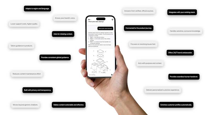
A trusted, brand-safe AI assistant that knows your products, your customers and your content.